Wednesday, August 4, 2010
Gender and Toys
Gender and Toys
Wednesday, July 28, 2010
Top 10 Toys of the summer
THE TOP 10 TOYS OF THE SUMMER
Tuesday, July 20, 2010
Thursday, July 15, 2010
Sketching with Painter
sketchatoy fifteen from sketchatoy on Vimeo.
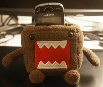
So have a look as I walk you all through the differences and similarities between Painter, Sketchbook, and Photoshop...then I draw my cell phone holder.
Monday, July 12, 2010
Ducky Delingos
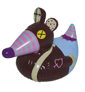
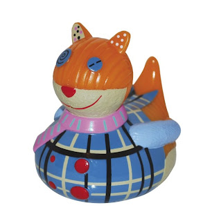
They were released on May 2010 and these toys feature four popular Delingos characters. Originally the characters were plush toys later transform into a bath toy without using the generic "duck" body. One of my favorites is the BigBos the Wolf.
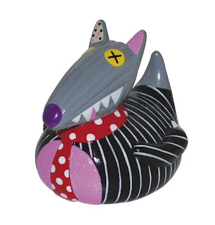
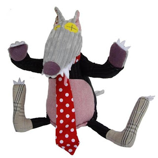
You can find the others here.
Sunday, July 11, 2010
McCarty PhotoWorks
Check it out HERE


Monday, July 5, 2010
Design By Committee Continued....
Your design sucks! from Paul Boag on Vimeo.
I found this video awhile back and found it helpful and funny. Have a watch.Why Design-By-Committee Should Die
Below is the article.
Why Design-By-Committee Should Die
by: Speider Schneider
No matter where you go in the known universe, there is design-by-committee. It has become a pecking order of disaster for the society that used to pride itself on being a mover and shaker and that allowed its mavericks and dreamers to innovate their way to success. In a business climate fueled by fear and the “Peter Principle,” as it is today, a decision not made is a tragedy averted. So, decision by committee provides a safe and often anonymous process for finger-pointing down the line… inevitably leading to the creative, of course.
Why It Happens
Wikipedia describes it thus: The Peter Principle is the principle that “in a hierarchy every employee tends to rise to his level of incompetence.” It was formulated by Dr. Laurence J. Peter and Raymond Hull in their 1969 book The Peter Principle, a humorous treatise which also introduced the “salutary science of Hierarchiology”, “inadvertently founded” by Peter. It holds that in a hierarchy, members are promoted so long as they work competently.
Sooner or later they are promoted to a position at which they are no longer competent (their “level of incompetence”), and there they remain, being unable to earn further promotions. This principle can be modeled and has theoretical validity. Peter’s Corollary states that “in time, every post tends to be occupied by an employee who is incompetent to carry out his duties” and adds that “work is accomplished by those employees who have not yet reached their level of incompetence.
Whether on staff or freelance, we all walk into meetings prepared for our work to be torn to shreds. And it always is. The client sits there trying to explain to you how a logo the size of a small melon should sit on a 9×12-inch ad.
Our core competency is in creating something that is the perfect communication vehicle for the given message. But then subjectivity walks in the door, and the creative is left standing there, looking like an incompetent who needs a committee to complete their work.
Others Have Noticed Its Effects
Michael Arrington, founder and co-editor of TechCrunch, a blog covering Silicon Valley technology, and a widely respected and influential person on the Web, recently wrote:
There’s a saying I love: “a camel is a horse designed by committee.” A variation is “a Volvo is a Porsche designed by committee.” Some of the best product advice I’ve ever heard goes something like “damn what the users want, charge towards your dream.” All of these statements are, of course, saying the same thing. When there are too many cooks in the kitchen all you get is a mess. And when too many people have product input, you’ve got lots of features but no soul.
Through it all, I’ve heard some wondrous and magical statements come from the mouths of non-creatives as they “join in on the fun” of designing in these dreaded committee meetings.
My favorite exchange to date happened in a meeting that a secretary sat in to take notes but who eventually took over the conversation. I looked at her and then the art director, who sat sheepishly quiet (from too many emotional beatings, no doubt), and asked why a secretary would be allowed to give design feedback. She pulled herself up in her chair and said, “Well, you do want this to be the best product it can be?”
“The best it can be.” She was somehow convinced that her opinion overshadowed all others, including those of the art staff. In her mind, she was actually saving the design. Stories like this abound.
You’re Not The Only One
Wanting to feel I was not alone, I posed the question to the art directors among my umpteen connections on LinkedIn. The responses were varied, passionate and maddening at times. One of my favorite Los Angeles art directors gave me a list of her favorite sayings overheard in committee meetings:
My wife wants more circles.
My husband says it doesn’t hit him in the gut.
My kids say there are too many words.
My dog didn’t wag its tail.
The waiter said he’s seen something just like that in France.
I need more oopmh in it.
I’ll know it when I see it. So go back and make more.
I love what _____ did. Can you do the same, but with carrots?
What are you doing after work?
The next respondent to my question asked, “Did you forget to take your meds today?” Another chimed in, “I don’t want to give you any stories because I don’t want to cry!”
One creative director added these: “Why isn’t my logo bigger?”, “Why can’t we use all of this empty space over here?” and “It’s too promotional”. He adds: “ Anything from anyone who’s ever said, ‘I’m not creative, but…’ or ‘It needs more… something.’ And anything from anyone who ‘knows what they don’t want but has to actually see what they do want because they can’t describe/direct/vocalize it.”
Plenty of responses advised us to let go and just take the fee and do whatever the client or committee wants. This is a “service industry” after all. One graphic designer wrote:
One thing I try to do is understand why certain decisions have been made, and I do this by questioning the person doing the direction (this could be a colleague, sales person, client, etc.). If that person has legitimate reasons for asking for specific things, and they can back up that it will work, I’d like to know.
Another voice added, “He who pays calls the tune, even if they’re wrong, and even if they have poor taste. That is important to keep in mind.”
As much as I agree, there is still that voice inside me that screams bloody murder at the idiocracy of group decisions. Feeling the same way, an art director in Texas wrote, “The client may pay for the work, but who takes the blame when the client campaign fails miserably because the client did not listen to the advice of the designer?”
Who Should Ultimately Decide?
For better or worse, I agree with another passage in Mr. Arrington’s article:
Product should be a dictatorship, not consensus-driven. There are casualties, hurt feelings, angry users. But all of those things are necessary if you’re going to create something unique. The iPhone is clearly a vision of a single core team, or maybe even one man. It happened to be a good dream, and that device now dominates mobile culture. But it’s extremely unlikely Apple would have ever built it if they conducted lots of focus groups and customer outreach first. No keyboard? Please.
He also illustrates his point brutally with this hard fact:
Digg is sort of on the opposite end of the spectrum. The company has been standing still now for years as Facebook, Twitter and others have run laps around it. But the company is famous for listening to its hard core fanatical users.
My point is best made through the brilliant, funny, intelligent Better Off Ted. In one adventure, the corporation empowers everyone to make decisions about products in committee. See what happens to the simple product. The always classic “Process (aka Designing the Stop Sign)” is another frightening example soaked in truth.
Marketing aims to create consumer interest in goods and services based on the assumption that the target consumer is buying a lifestyle or habit, with some income, location and loyalty considerations thrown in. It draws from information about the target demographic; however, personal preferences about color, type size, logos and so on do not represent those of the target demographic. One person on a committee might be a target consumer, but certainly not the committee as a whole. Should people from disparate demographics second-guess the visual approach taken by the designer to the target consumer?
Mr. Arrington believes that the plan trumps all voices. His article ends with a very assertive video about winners and losers. Most creatives choose to let it wash over them and collect their pay check. I suppose I don’t agree because I haven’t seen many pay checks made out to “Dance, monkey, dance!”
What’s The Solution?
From all the responses and stories, it seems there are few ways to live with the design-by-committee lifestyle. Suggesting what a marketing plan or piece of copy is missing or implying that the secretary is unable to spell will only get you pegged as “difficult” and make you appear as though you “overstep boundaries.” Asking a non-creative who gives you excruciating input why they think you’re incapable of doing your job will brand you as “defensive” and “combative.” Give in, and you’ll earn descriptions like “flexible” and “easy to direct.”
The sensible answer is to listen, absorb, discuss, be able to defend any design decision with clarity and reason, know when to pick your battles and know when to let go.
A photographer I know once said, “I’ll give the model a big mole on her face, and the committee focuses on that and are usually satisfied with the momentous change of removing it and leave everything else as is.”
Whether you’re on staff or freelance, the political dance of correctness and cooperation brings a new story and new experience every day. And isn’t that one of the great things about this business… even if it goes around and around sometimes? You can just blame someone using the new buzzword, “Commidiot,” which is a committee member who has no idea what is going on in front of them but feels they have to say something of importance to justify their presence in the room.
Friday, July 2, 2010
LEGO Form Language
He did find this great video about the manufacturing process of LEGO.
Monday, June 28, 2010
Toy Design Thread and Toy Store Fun!
Sing-A-Ma-Jigs from sketchatoy on Vimeo.
Also a few of the contributors and myself stopped by ToysRUs and had some fun with the new Sing-A-Ma-Jigs released this year by Mattel. I captured some of the play patterns with my cellphone.Monday, June 21, 2010
Scan Toys
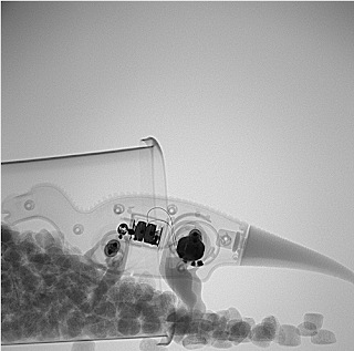

Check out more of there work Here on a Flickr photostream.
Wednesday, June 16, 2010
kidchuckle
Mecha Santa from kidchuckle on Vimeo.
He has more tutorials on his youtube , or vimeo. Stop by his website, deviant, or coroflot, to check out more amazing work.Friday, June 11, 2010
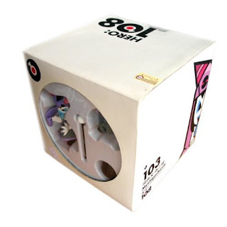
Hero 108
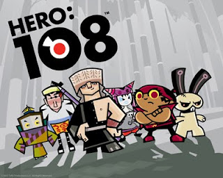
I like how the show is very stylized with sharp edgy characters. Each the characters also have a unique back story in which you can find here. Mainly I love that the style of shows reminds me so much of the vinyl toys scene. Luckily, I was able to find a few that was only distributed from last year's comic con in San Diego.
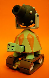
This is the turtle that the character rides on when they're on a mission to save their Commander Ape Trully. The next toy below is Mystique Sonia and the packaging they came in. She's been cursed with a spell when anyone who tell her he loves her three times in a row turns into a Yaksha. This creature sits on her head like a hat that also protects her from harm.

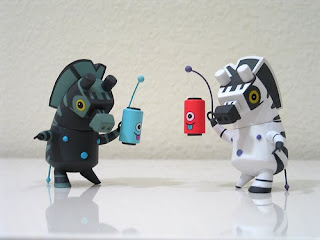
My favorite characters are the Zebra Brothers. I like their different color combination inspired from Ying Yang symbol. They're actually some of the villains of the show. The lanterns they're carrying have magical powers especially when there's a full moon.
Enjoy! Remember to check back soon!
Thursday, June 10, 2010
Patch Together

Ever have that idea you know will make it big but you just don’t have the cash, know how, or resources to bring it to life? I know it’s difficult…luckily there is Patch Together. This was a cool website I found through an artist I follow on Deviant Art. Basically you upload illustrations, 3 views, CAD renderings…anything you want and then the members of the community vote if they would buy it as a toy, a t-shirt, or both. If you get enough votes then you can get your ideas manufactured! I think it’s pretty cool so check it out.
Blog Updates!
- MG is responsible for the awesome plush tutorial.
- Boxerinside is a da Vinci inspired gadget geek
- happyapathy is a vinyl toy junkie that has sent me many-a-posts
- GM teachers a sketching class while getting his masters,
I think they will add some well needed diversity to this blog.
If you have been following the blog since it's creation you know that I normally do a monthly feature. I am sorry but there will not be one for the month of June. I do however have several lined up that I have been meaning to e-mail. So never fear more professional knowledge will be coming!
Photoshop Styles Tutorial
sketchatoy fourteen from sketchatoy on Vimeo.
Hey everyone this a new technique I have been using recently since things are very busy right now at work and I need to get lots of concepts out quickly while maintaining the quality expected...this is how I do it. From beginning to end this rendering probably took me all of 15min. You get something pretty good looking quickly using these styles, so enjoy!
Thursday, June 3, 2010
I'm not dead!
Design critic Alexandra Lange goes shopping for the perfect kids toy--and finds so much design falls short.
 It was perhaps the fifth or sixth time I found myself, flat on the floor, arm extended, sweeping a broom under the couch to try to retrieve the quarter-size wheels of my son’s Automoblox Minis that I thought, “This is not a good design.”
Everything about them looked great. Automoblox share the traits of many toys sold at Giggle, the MoMA Design Store, and the overpriced kids boutique in your neighborhood: They are made of wood, the colors are bright and unisex, they use no batteries, they evoke the past, and they cost significantly more than the plastic, pink-or-blue, light-blinking, noise-making blobs sold at Toys R Us. These qualities explain why three different people decided Automoblox were the ideal gift for the offspring of an architect and a design critic.
And yet, my son seemed perplexed by how to play with them, beyond rolling them back and forth, something any die-cast drugstore school bus can do. Automoblox promises creativity: “With Automoblox, your child plays outside the box—and builds the design pictured in his or her mind.” First, I think they are starting the advertising clichés a little young. Second, those design options are severely limited. You can exchange a sporty rear end for a utilitarian one, a green transparent cab for a purple one, one set of colored tires for another. But whatever you do, you get another car.
It took my husband’s outside-the-box thinking to make the whole thing into a flatbed (it takes two axles and all the center sections). Then we had a pile of unusable spare parts, including those wheels, which seem designed to be lost (replacements are $10). The box promised interchangeability, but all the change was color, not function. Automoblox are really like dolls for (primarily, not to stereotype) boys. All you can do is change their outfits.
 Despite appearances, Automoblox are a trophy toy: all looks, no lesson. And as I survey the field of design toys for kids, I see too many other wooden, bright, no-battery, retro, expensive items that seem like no fun. It’s ironic that these are all aimed at the design-loving parent, because, with their emphasis on looks and embedded modernism, they are teaching precisely the opposite of outside-the-box thinking.
 I see my son gravitating toward two poles in toys, either the entirely abstract, like plain blocks or the very specific, like Matchbox cars or fake fruits or Fisher Price Little People (I bought him the 1974 airport on eBay--the toy I always wished I had). The plain blocks allow kids to make anything. The cars, fruits, or Little People help them pretend to be adults. The blocks are totally modern--Frank Lloyd Wright played with unpainted Froebel blocks, Maria Montessori advocated toys with only one or two qualities that change (like blocks that were all square, all one color, but graduated in size). The cars and people, not so much.
 I asked Lisa Mahar, owner of educational design store Kid O (who produced the block sets above and below) if there was any theory behind my hypothesis, and she said there was, to a point. “Montessori theory does back this up. Fruit, animals, maps, anything natural is presented in its true form. Manmade items like cars, buildings aren't represented in these schools. At City & Country School kids create man-made things on their own with blocks, paper, or wood.”
 So Automoblox would not be allowed in that classroom, but the principle still applies. What’s problematic about Automoblox is partly that kids can’t exercise their own vision--all the cars come out looking like Corvettes—but also they also can’t play garage, or airport, or museum. The cars do too little. Other equally cool-looking toys, including seemingly basic sets of blocks, are gussied up with too much conflicting information.
 Take House Industries’ Alexander Girard alphabet blocks, for example. “For a child learning how to read or spell, the letters are too stylized. There is also no reason for the colors—i.e. vowels aren’t all one color,” Mahar says. They are another trophy, one that would look good piled artfully by an adult on the bookshelf. I suspect no child really wants to make the Eames House either, the theme of the latest (and sold out) set of House Industries blocks.

If you want something that looks more fun than a Froebel set, better to buy the translucent Magna-Tiles (pictured below), or for smaller kids, buy the stackable SoftBlocks.

At the Museum of Modern Art’s Shape Lab, many toys are homemade, like yoga blocks with magnets attached, which allow visitors to explore wall composition a la Donald Judd. They have also used Grimm’s wooden blocks (pictured below), which are vegetable dyed (since paint chips), and toys from Learning Materials Workshop. “Our focus is on the open-ended, to let visitors build on their experiences instead of the toy guiding what the experience should be,” says Elizabeth Margulies, Educator, MoMA School and Family Programs.

I am not willing to ban representations of the man-made from my toy drawers. For a city child, I believe trucks, buses, rollers, and excavators are part of their natural world, and sometimes the farm focus of children’s literature can seem obsessive and out-of-place. There are a number of specific, operable, not battery-powered vehicles that let kids be in charge of their world, if not make it from scratch. Some are, however, plastic.
In my house the unused Automoblox pieces get compacted in the Battat Garbage truck, a sturdy, not garish item that sells for less than $20, has an operable hatch, and even comes with two trash cans. There’s even an eco-version, a recycling truck made of recycled plastic by GreenToys (of course).
 From the moment he ripped open the box on the Battat, not for one instant was my son confused about its highest and best use. So buy the trophy toys for yourself--and don’t overlook the plain little cubes in the corner next time you are searching for the perfect toddler gift.
Alexandra Lange is an architecture and design critic, journalist, and historian based in Brooklyn. Her work has appeared in The Architect's Newspaper, Design Observer, Icon, Metropolis, New York Magazine and The New York Times. She is co-author, with Jane Thompson, of Design Research: The Store That Brought Modern Living to American Homes (Chronicle, 2010
Thursday, May 6, 2010
Essential InDesign
sketchatoy thirteen from sketchatoy on Vimeo.
For those of you who made it through our entire portfolio podcast, you will hear *beep* and I debate what program to use for laying out your portfolio, in the end I agreed to doing an ID tutorial. I promise you will save time using ID over AI or PS and this is by far the superior page layout program because it is infact specifically for that!
Monday, May 3, 2010
Nicholas Groves Feature!
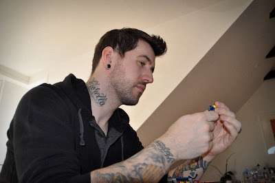
Hey everyone, I'm really excited to bring this interview to you because I for one grew up playing with LEGO for hours on end. Nicholas talks about some really cool stuff and is very insightful so please take the time to read the whole interview especially if you love LEGO! And once you're done feel free to check out his Coroflot for more of his work.
1. You seem to love what you do; can you remember when you were bitten by the LEGO bug?
I guess, like most people, it started when I was a young boy. I think I was around 4 or 5 when I first starting playing and building with LEGO. I have an older brother, so most of my LEGO was passed down to me from him, and to be honest it was many years before I realized that LEGO actually came in sets. I just assumed it came to your house in a big Tupperware box! Me and my brother would build lots of spaceships then have a massive intergalactic space battle! This would normally end up in a BIG mess much to our poor mother's dismay.
However, once I got a little older it was decided I was too old for LEGO and it was all passed onto my younger sister and then to my younger cousins. So I didn't really touch LEGO again until they approached me about work - I was going through what the Adult LEGO fans call 'my dark age'. That's the dark, sad period in your life when you have stopped playing with LEGO before you rediscover it again. One part of me wishes I still had my old LEGO stashed away in the attic, but alas, I have no idea where it is now. However that's one of the things that makes LEGO different from most other toys. The LEGO that my family and I played with is probably still being enjoyed by some kid I'll never even meet. It's very rare that LEGO goes in the trash, unlike many other toys it takes on a life of its own and jumps from child to child, which is amazing.
2. LEGO pieces connect and build upon each other, how do you think designing a LEGO toy differs from tradition toy/product design?
Hugely. In most toy/traditional design, you can sit down, sketch out an idea, make a mock-up, put it into CAD, have a mold made and stick the product in a box (that's obviously the VERY short version!). We can't do that. With LEGO, you are working with a 'system', and that changes the design process a lot. Not only do we have to come up with cool ideas for vehicles, buildings, functions, characters and play scenarios but we then have to sit down and make it from scratch with our hands. Getting the idea from your head into brick is the main process we go through, you can't just mold up any shape or brick you want. You have to find the bricks that give you the form you want and then make sure its stable and build-able for a child. So it becomes a bit of a puzzle trying to get a great looking model that's build-able, fun to play with and on budget.
The fact we make our toys from a building system means we have to pretty much know every element and how they will work together. Becoming a LEGO designer is a bit like taking on a old fashioned apprenticeship in many ways. You work with a more experienced designer to get your building skills up to par and there is nowhere else you can learn these skills. We're the only team that do what we do and it can take a decent amount of time to be a good builder. Of course, almost anybody can go out and mold some bricks and put it into a box, but when you're working with people who have been doing it for 20+ years you know nobody out there can top them. The knowledge and the quality within the team is not something you can copy so easily and it's great to work with designers like these.
When we start sketching models after a briefing, we normally grab a big box, go to the element basement and grab handfuls of the elements we think might work and meet our needs. Then we will sit down in a group for a couple of days and build away. At this early stage we may even spray paint elements we don't have in the right colours yet and start discussing new elements and if they are needed. From this we will then pick the strongest models and functions and use those as a kick start for the project and design process. We go through many loops and variations before we get to the final model, you never get the model right the first time round.
One important stage we go through, is called 'model review', this is when I (or any other designer) will sit down with a committee consisting of: two other model designers, somebody from our building instructions team, an element engineer and somebody from global quality control. Together with my creative lead, this group will all build the model brick by brick so we can agree it is up to LEGO standards. This is a very crucial process that every LEGO model has to go through. If the team does not agree with any part of the model, it has to be addressed and shown to the team again before it can go into production. It's kind of like an exam for the designer! Plus you have to do this all from memory, not so bad if your doing a $10 set, but once you get in the $120 sets with 2000+ elements in it, then you really have to make sure you remember where every brick goes.
3. How do you approach your designs for LEGO as opposed to other products? Do you design each LEGO toy with expansion in mind (combining with other LEGO toys)?
Expansion is a given when your talking about LEGO, bricks today work with bricks that were molded 40 years ago so its not something we have to worry about or factor in too much when designing. Obviously there are sets that have multiple models made from the same set of bricks and that has it own set of challenges for the designer, plus this has usually been decided at the start of the project so the designer can factor in the right amount of time. It involves extra design loops for the team, but normally we focus on making one great main model, then try to make others based on the elements available... So again, it becomes a bit of a puzzle.
When starting a model or models, we simply start with brainstorming ideas. We normally start by creating a universe where we can base our story and characters. From this, the early ideas for the sets can develop. We pick key points from our story that will allow the kids to create and act out the adventure in the world we have made for them. Once we have a good foundation, we then sketch up some ideas in bricks and start looking at what is or is not working.
4. I’ve heard that LEGO has a custom CAD program they use, is that true? If so what’s the name and where can one find it?
Yes we do, its called 'Easy Builder Tool' or EBT as we call it in the office. It's an add-on to Maya that was made for us, and essentially, it has every LEGO element on file that we can import and build with. It also has extra features that only we would use, for example you can import all the 9 elements you need to make up one LEGO mini figure, then instead of assembling it yourself (which can time a lot of time) you can hit a button and EBT will piece it together for you. It's used mainly by our building instruction teams who can layout all the steps one by one and then have them rendered in hi-res. We as designers can also use it for costing and pricing of models as every element has a price, we can import all the parts and see how much it would cost. As far as I know, it's not out there for the public to use, but there is a program out there called LDraw that AFOL's (Adult Fans of LEGO) use to make renderings and do their own building instructions.
5. Do you start each design with a sketch, jump right into CAD, or simply grab a box of LEGO and start ideating?
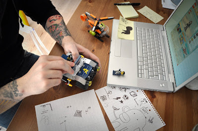
It depends on the model and the designer really. If I'm working on an IP like Toy Story, then we already have a lot of reference to work from and I don't really need to sketch anything up on paper. The challenge there is to get the image that you see on screen into bricks, so on one hand, that's great because you can jump right into the building. But sometimes it can be hard if the vehicle or building is made up of some crazy abstract forms. However, if I'm working on a LEGO property like Agents 2.0 then I will do a sketch or two... and I do mean a sketch! There is no need to sit there and do a detailed marker or digital rendering, you need to get into the bricks and building ASAP as there will be many build issues to solve and time is always against you. 90% of my sketch work is done on Post-It notes and bits of A4 I grabbed out of the photocopy room. I simply sketch to help get a form or iconic shape out of my head and onto paper, it just helps to scribble the idea up a little before building. I then break the drawing down into simple shapes, and with that, you start to see in your mind's eye what elements could work to give you that form. I don't use CAD at all for my LEGO work, obviously those designing new elements will use Rhino and other CAD tools but as a builder you're ready to roll as soon as you're happy to start building.
6. If you could describe the LEGO marketing stance in the industry what would it be? How do you use the brand angle to influence your designs?
We have a company motto "only the best is good enough", so the design team have a lot to live up to. We really try to ensure that we offer the kids a great model that they will not only enjoy playing with but that they will also enjoy building. We have to think of the whole process from the ground up and not just them playing with the finished model. Making sure that the kids enjoy building the toy is just as important as the final model itself. We call it "Joy of Building, Pride of Creation". Ultimately you want a child to open the box, have fun building the set, have fun playing with the set and then have fun tearing it down to make something new from their own imagination.
LEGO is a very trusted global brand and we as a company do our best to live up to that. With this in mind, you can't help but let it affect your design work, knowing your product will be played with by kids almost all over the world really pushes you do something great.
7. LEGO has so many component parts yet I’m sure you still create products that need something new. How do you go about adding new pieces and how do you keep track of the thousands already in production?
Actually, over the past few years we have gone though a process of streamlining the amount of elements we produce. We have been trying not to produce tons of new elements a year because that would just make us like any other toy company. So when it comes to adding new elements we have to really think about how needed it really is, possible new element go through many check points before they are given the OK.
Most new elements will got towards updating and giving the mini figures a fresh new twist. Kids and adults love the LEGO mini figure, so we try to add lots of newness and collect-ability to them. New wigs and accessories are the areas that will make a set even more appealing to kids and fans, so we try to offer something new with every set. Ultimately, we have to find the right balance, it's great to provide something new, but we don't want to produce 50 new elements just to make one model.
As for keeping track of all the elements in production, that involves lots of Excel spread sheets and big computers that makes my brain hurt. There is a huge logistical side to LEGO that's on a global scale and we have project managers within our design team who help keep track of this and ensure the elements and sets get to the right place when we need them.
8. Do you sometimes find the restriction of LEGO construction limiting when your design?
There's really not much you can't do in LEGO, so I never see it as a limitation. For me, designing a LEGO set is like creating and solving a puzzle all at the same time. You know what you want to build, so you have to find the right parts that make it work. There is a lot of trial and error and sometimes that will result in me banging my head against my desk, but there are days when it flows together nicely and that's all part of the design process.
The great thing about working at LEGO is there is always somebody who will have an idea to solve your problem. If I get stuck I can talk to members of my team or go find somebody who has some expertise in that field. Sometimes if we are doing a function in a model that uses gears and cross axles, we will go have a chat with the Technic design team, so you're never far from somebody who can give you some good advice.
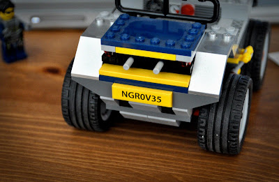
9. What programs or tools could we find in your arsenal that you couldn't design without?
Post-It notes: I tend to do a lot of doodles and list making on these, I should probably take out stocks with these guys?!
A small pallet knife: Separating plates and bricks all day takes its toll on your hands....and teeth! A small artist knife makes life a lot easier.
My hands: Without these, I can't build, so they really are my most important tools... Maybe I should get them ensured.
10. Do you have advice for young designers wanting to break into the field? And for those already in the field what advice do you have?
For the younger designers, I would say: Don't be afraid to be you. When we are looking for designers, we're not only looking for good design skills but a great personality who will bring fun and life to the team and their models. I went to a very traditional design school with a long engineering history, so some people figured I was a little odd because I liked doodling cute characters and watching cartoons.
For those of use already there, I would say: Take time out to step back and look. It's all to easy to get tunnel visioned and forget what's going on in the world around you. So don't be afraid to take the time to watch a cartoon, read a book or go to the local toy shop.
11. What other artists/designers do you look to for inspiration?
Matt Groening and Pixar have a great ability to create characters and universes that we all love, and I don't think there is a piece of work they have done I don't like.
If we are talking 'classic' designers then I'd I say: Dieter Rams and Mark Newson are two of my favorites.
Friday, April 30, 2010
It's Nerf or nothing!
Here's a great video from his page, maybe him and a few friends I'm not sure. Great to see people still having fun with Nerf no matter how old, I want a gun now!
Also because this is a sketching page how about some amazing Nerf concept renderings to get you all inspired?

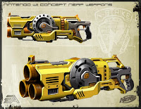
Now for some nostalgia. Here are some of my favorite Nerf toys that by little brother and I owned growing up. What were yours?

Check out NerfGuns.org for all the old school guns.
Enjoy, and remember to check back in a few days because I have another interview to post and if you love LEGO then you won't want to miss it!
Monday, April 19, 2010
Monday, April 12, 2010
IDSA S. district
I took in so much while I was there, met with so many students and companies trying to build a network for work but also for the blog. To the readers who attended and helped me spread the word, this thing is growing so I really want to thank you all. On that note I have just a few highlights for you to check out.
First, maybe the highlight of the event for the students, was the student merit award presentations and ceremony. I'm actually pissed that I didn't take pictures, I like to think I was respecting the presenters. Here's a short video clip from the award ceremony.
sketchatoy@IDSA from sketchatoy on Vimeo.
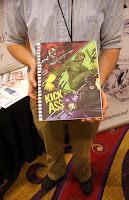
The winner was Arvin Abadilla from the University of Houston, TX. He had really good work and some clever products, so check out his website or his coroflot.Also, I met a student through one of the readers who had some amazing sequential work. Not really toy related but the dork in me must post.

Wednesday, April 7, 2010
Star Wars Win

I was browsing the internet tonight looking for some images to map some fabric on for a new tutorial and stumbled across these novelty items

They are some of the coolest things I have ever seen when it comes to licensed product, unfortunately these are all the rejects. I wont post them all but if you follow this link and this one to Geekologie then you can read all about them.

The marker rendering are unbelievable, I'm going to try my best to track down the guy or gal for a feature. Wish me luck!
Tuesday, April 6, 2010
Monkey Doodle Dandy Feature!
Please take a minute to stop by their website and check out their portfolios. They have great work and you will learn tons. Enjoy the interview!
1. You are a husband and wife consultancy/studio, that’s awesome! Could you give us a little history on how you ended up together as a design team?
We were both working at full-time jobs. Kurt was art director for a local newspaper chain, and I was an art director at a toy company. (So, I guess we have being bossy in common.) Kurt was really not happy, he didn't have much chance to be creative and there was no place in the company for him to move up. He was trying to work on his own projects at home, but it was really tough. His hours at the newspaper were very long and soul-sapping. He decided to live frugally and quit his job and see what happened. Luckily for our bank account, the toy company where I was working needed freelancers, so I recommended him, and as it turned out, they loved him and continued to send projects his way. I basically liked my full time job, but I was also at the point where there was no more room for growth. There were so many other creative avenues that I wanted to explore, but it wasn't possible to do while working 14 hour days for someone else. My original plan was to take 6-9 months off for exploring, drawing, painting and refreshing my brain, but I started to get freelance jobs, too, and I guess I was a little bit of a work-a-holic and I couldn't turn them down, so Kurt and I decided to incorporate and have a design company!
2. Have either of you worked as an in-house designer? If so how does this differ from employing yourself? What are some of the benefits of working for yourselves and some of the pitfalls?
Kurt has worked as a designer for newspapers, and I have worked for a few toy companies (as well a newspaper when I first got out of college). Working for ourselves has given us the ability to dedicate some time to developing our own properties. We don't have to waste time commuting or sitting through endless meetings. Occasionally, we can play hooky and sit in the park on a beautiful Wednesday afternoon and there's no one to answer to. We feel like we have more control over how much money we make, too. When you work full-time, if you work on the weekends, or until 4 am, you still get the same check at the end of the week. But if we work super long days, at least we get paid for it. It makes it easier to give up sleep. And we can bring our dog to the studio!
There are definitely pitfalls, too. There are those times when there are no checks coming in, and you start to get really nervous about paying bills. It gets hard to separate work from personal life because you can never truly get away from it. You're always talking about work, thinking about work, dreaming about work. Even though we worked long hours when we were in-house, we work much longer hours now!
3. Your studio is called Monkey Doodle Dandy, Inc. Where’d you come up with the name?
Um, I don't really remember! I think we wanted to communicate that we were fun and silly, and do art. So, that's the "Monkey", the "Doodle", and then the "Dandy" was just catchy.
4. Who is responsible for what at the studio?
We have our individual clients, but we also share a lot of work and help each other out when we get swamped. Kurt takes care of most of the billing and office work, which is a full time job in itself. I try to drum up new business. But mostly, we both do everything.
It's striking a balance between maintaining your creative integrity and knowing when to "roll over and play dead" - meaning that the client is after all the client. They are paying the bill, and you might not agree with their decision; but you must smile and accept it. At the end of the day, the client owns the work, not the studio. The faster you realize that the better, or freelancing is not for you. No client is going to come back to you with repeat business if you are argumentative. They need the work done quickly and to their specs. To balance that out, we're developing our own characters and products that we have complete creative control over. That's where we can be picky, and love it and hug it and squeeze it. Because WE own it.
6. Your studio does mostly illustration, concepting, branding, and product licensing. What’s the process when working on a product? How does it get from the sketch, through the control drawings, and into production? Do you continue to work alongside the engineers and industrial designers or is the next time you see your concept when it hits the stores?
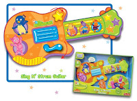
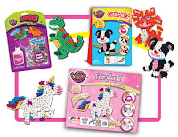
Each project is different. Sometimes, we work on one little aspect of the product and we might not even know what the big picture is. Other times, we get to be involved from the very beginning - fleshing out the idea, thinking up names, doing drawings and presentations, working with the engineers. That kind of project is the most fun. And it's always fun when you see your concept on the shelves or in a tv commercial.
7. The product illustrations on your page are fantastic. How do you approach the presentation illustrations and what are some tips you would give to keep a product illustration looking playful rather than just sitting there static on the page?
Thank you! I'm not really sure what tips we have. Kurt especially is great at doing shadows and highlights and making the toys look super shiny.
8. You two have some great concepts coming straight out of the studio including my personal favorites Squaredy Cats ™ and Squarey Monsters ™. Can we expect to see these coming to market?
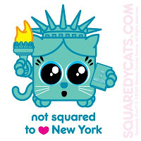
Thanks! We were hoping to see the Squaredy Cats plush in stores nationwide in October, but now it looks like early 2011 is more realistic. We're really excited, because we just signed a deal with one of the largest plush companies in the country! We can't say the name of the co.yet, though. Both Squaredy Cats and Squarey Monsters already have a deal in place for vending machine stickers and temporary tattoos across the US and Canada. So look out for them! They will also be showing up, along with GirlMonsters, as an iPhone app from Shakey Planet.
9. I see you have a licensing show coming up in June. How important is it for consultants, freelancers, or even just artists and designers in general or attend these shows and fairs to get their name out there, network, and see what’s new and fresh?
Thanks for reminding us of that. We have now taken that banner off of the web site, because it was actually 2009. It's so expensive, that we can't afford to exhibit this year, although we would still like to attend the show in 2010 as visitors. That being said, it is very important to attend the shows, fairs, exhibits, groups, meetings, etc. You can't spend all of your time drawing in the studio. You really need to get out and meet other designers, see what everyone else is working on and thinking up. We always find that we return to the studio with a renewed determination to create good work. That's also how you make contacts for collaborations, jobs, everything.
10. What programs, tools, or simple inspiration objects could we find in your studio that you couldn’t design without?
E-mail. Almost no one ever calls, but everyone e-mails. If our e-mail goes down, we lose our minds.
11. Do you have advice for young designers wanting to break into the field? And for those already in the field what advice do you have?
Just to keep working, believe in yourself and your personal style, and know that it's really hard, but there will come a time when it gets easier. Call people, meet people, get out there. And don't waste beautiful days when you could be drawing in the park. I've wasted a lot of gorgeous, sunny days sitting in my dark studio, but I'm determined not to do that anymore!
12. What other artists/designers do you look to for inspiration?
We like old monster movies, cartoons, fairy tales, weird animals, and friends and random people we run into who are designing stuff and making art. Some of the creators who inspire us are Jim Benton, Jhonen Vasquez and Arthur Rakham. We look at a lot of contemporary cartoons, and children's programming to see what's happening, and do an awful lot of poking around at the gazillions of artist portfolios online. There's so much to look at that is a constant inspiration.
New Look!
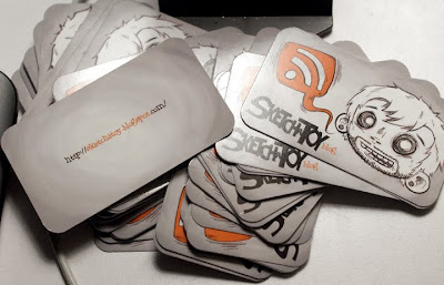
Funny story actually, I wasn't sure if I wanted the corners rounded or not so I ordered them squared. When they arrived I took my rounding punch and did it to one card and loved it! I then painstakingly went through all 50 cards and rounded the corners myself...needless to say my thumbs are sore. O_O
I'm actually ramping up for the IDSA conference this weekend and I wanted to promote the blog a bit to some students and any professionals I may meet. I couldn't be happier with how these cards turned out.
I think now is a good chance for me to promote our first podcast! I will be participating in the two portfolio reviews so if any of you are part of the southern district IDSA then I hope to see you there. Now is the time to listen to that podcast and review your portfolio with our top ten do's and don't in mind.


