Sing-A-Ma-Jigs from sketchatoy on Vimeo.
Also a few of the contributors and myself stopped by ToysRUs and had some fun with the new Sing-A-Ma-Jigs released this year by Mattel. I captured some of the play patterns with my cellphone.Monday, June 28, 2010
Toy Design Thread and Toy Store Fun!
Monday, June 21, 2010
Scan Toys
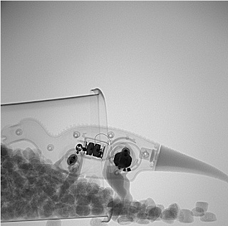
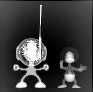
Check out more of there work Here on a Flickr photostream.
Wednesday, June 16, 2010
kidchuckle
Mecha Santa from kidchuckle on Vimeo.
He has more tutorials on his youtube , or vimeo. Stop by his website, deviant, or coroflot, to check out more amazing work.Friday, June 11, 2010
Hero 108
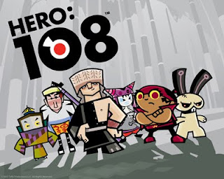
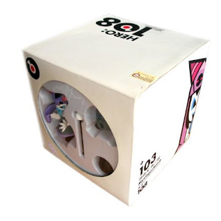
I like how the show is very stylized with sharp edgy characters. Each the characters also have a unique back story in which you can find here. Mainly I love that the style of shows reminds me so much of the vinyl toys scene. Luckily, I was able to find a few that was only distributed from last year's comic con in San Diego.
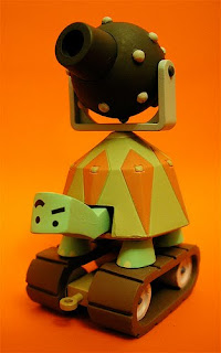
This is the turtle that the character rides on when they're on a mission to save their Commander Ape Trully. The next toy below is Mystique Sonia and the packaging they came in. She's been cursed with a spell when anyone who tell her he loves her three times in a row turns into a Yaksha. This creature sits on her head like a hat that also protects her from harm.

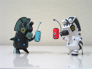
My favorite characters are the Zebra Brothers. I like their different color combination inspired from Ying Yang symbol. They're actually some of the villains of the show. The lanterns they're carrying have magical powers especially when there's a full moon.
Enjoy! Remember to check back soon!
Thursday, June 10, 2010
Patch Together

Ever have that idea you know will make it big but you just don’t have the cash, know how, or resources to bring it to life? I know it’s difficult…luckily there is Patch Together. This was a cool website I found through an artist I follow on Deviant Art. Basically you upload illustrations, 3 views, CAD renderings…anything you want and then the members of the community vote if they would buy it as a toy, a t-shirt, or both. If you get enough votes then you can get your ideas manufactured! I think it’s pretty cool so check it out.
Blog Updates!
- MG is responsible for the awesome plush tutorial.
- Boxerinside is a da Vinci inspired gadget geek
- happyapathy is a vinyl toy junkie that has sent me many-a-posts
- GM teachers a sketching class while getting his masters,
I think they will add some well needed diversity to this blog.
If you have been following the blog since it's creation you know that I normally do a monthly feature. I am sorry but there will not be one for the month of June. I do however have several lined up that I have been meaning to e-mail. So never fear more professional knowledge will be coming!
Photoshop Styles Tutorial
sketchatoy fourteen from sketchatoy on Vimeo.
Hey everyone this a new technique I have been using recently since things are very busy right now at work and I need to get lots of concepts out quickly while maintaining the quality expected...this is how I do it. From beginning to end this rendering probably took me all of 15min. You get something pretty good looking quickly using these styles, so enjoy!
Thursday, June 3, 2010
I'm not dead!
Design critic Alexandra Lange goes shopping for the perfect kids toy--and finds so much design falls short.
 It was perhaps the fifth or sixth time I found myself, flat on the floor, arm extended, sweeping a broom under the couch to try to retrieve the quarter-size wheels of my son’s Automoblox Minis that I thought, “This is not a good design.”
Everything about them looked great. Automoblox share the traits of many toys sold at Giggle, the MoMA Design Store, and the overpriced kids boutique in your neighborhood: They are made of wood, the colors are bright and unisex, they use no batteries, they evoke the past, and they cost significantly more than the plastic, pink-or-blue, light-blinking, noise-making blobs sold at Toys R Us. These qualities explain why three different people decided Automoblox were the ideal gift for the offspring of an architect and a design critic.
And yet, my son seemed perplexed by how to play with them, beyond rolling them back and forth, something any die-cast drugstore school bus can do. Automoblox promises creativity: “With Automoblox, your child plays outside the box—and builds the design pictured in his or her mind.” First, I think they are starting the advertising clichés a little young. Second, those design options are severely limited. You can exchange a sporty rear end for a utilitarian one, a green transparent cab for a purple one, one set of colored tires for another. But whatever you do, you get another car.
It took my husband’s outside-the-box thinking to make the whole thing into a flatbed (it takes two axles and all the center sections). Then we had a pile of unusable spare parts, including those wheels, which seem designed to be lost (replacements are $10). The box promised interchangeability, but all the change was color, not function. Automoblox are really like dolls for (primarily, not to stereotype) boys. All you can do is change their outfits.
 Despite appearances, Automoblox are a trophy toy: all looks, no lesson. And as I survey the field of design toys for kids, I see too many other wooden, bright, no-battery, retro, expensive items that seem like no fun. It’s ironic that these are all aimed at the design-loving parent, because, with their emphasis on looks and embedded modernism, they are teaching precisely the opposite of outside-the-box thinking.
 I see my son gravitating toward two poles in toys, either the entirely abstract, like plain blocks or the very specific, like Matchbox cars or fake fruits or Fisher Price Little People (I bought him the 1974 airport on eBay--the toy I always wished I had). The plain blocks allow kids to make anything. The cars, fruits, or Little People help them pretend to be adults. The blocks are totally modern--Frank Lloyd Wright played with unpainted Froebel blocks, Maria Montessori advocated toys with only one or two qualities that change (like blocks that were all square, all one color, but graduated in size). The cars and people, not so much.
 I asked Lisa Mahar, owner of educational design store Kid O (who produced the block sets above and below) if there was any theory behind my hypothesis, and she said there was, to a point. “Montessori theory does back this up. Fruit, animals, maps, anything natural is presented in its true form. Manmade items like cars, buildings aren't represented in these schools. At City & Country School kids create man-made things on their own with blocks, paper, or wood.”
 So Automoblox would not be allowed in that classroom, but the principle still applies. What’s problematic about Automoblox is partly that kids can’t exercise their own vision--all the cars come out looking like Corvettes—but also they also can’t play garage, or airport, or museum. The cars do too little. Other equally cool-looking toys, including seemingly basic sets of blocks, are gussied up with too much conflicting information.
 Take House Industries’ Alexander Girard alphabet blocks, for example. “For a child learning how to read or spell, the letters are too stylized. There is also no reason for the colors—i.e. vowels aren’t all one color,” Mahar says. They are another trophy, one that would look good piled artfully by an adult on the bookshelf. I suspect no child really wants to make the Eames House either, the theme of the latest (and sold out) set of House Industries blocks.

If you want something that looks more fun than a Froebel set, better to buy the translucent Magna-Tiles (pictured below), or for smaller kids, buy the stackable SoftBlocks.

At the Museum of Modern Art’s Shape Lab, many toys are homemade, like yoga blocks with magnets attached, which allow visitors to explore wall composition a la Donald Judd. They have also used Grimm’s wooden blocks (pictured below), which are vegetable dyed (since paint chips), and toys from Learning Materials Workshop. “Our focus is on the open-ended, to let visitors build on their experiences instead of the toy guiding what the experience should be,” says Elizabeth Margulies, Educator, MoMA School and Family Programs.

I am not willing to ban representations of the man-made from my toy drawers. For a city child, I believe trucks, buses, rollers, and excavators are part of their natural world, and sometimes the farm focus of children’s literature can seem obsessive and out-of-place. There are a number of specific, operable, not battery-powered vehicles that let kids be in charge of their world, if not make it from scratch. Some are, however, plastic.
In my house the unused Automoblox pieces get compacted in the Battat Garbage truck, a sturdy, not garish item that sells for less than $20, has an operable hatch, and even comes with two trash cans. There’s even an eco-version, a recycling truck made of recycled plastic by GreenToys (of course).
 From the moment he ripped open the box on the Battat, not for one instant was my son confused about its highest and best use. So buy the trophy toys for yourself--and don’t overlook the plain little cubes in the corner next time you are searching for the perfect toddler gift.
Alexandra Lange is an architecture and design critic, journalist, and historian based in Brooklyn. Her work has appeared in The Architect's Newspaper, Design Observer, Icon, Metropolis, New York Magazine and The New York Times. She is co-author, with Jane Thompson, of Design Research: The Store That Brought Modern Living to American Homes (Chronicle, 2010
